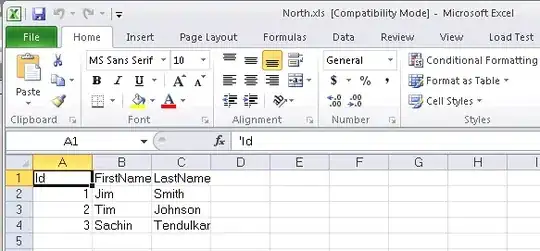
What I'm currently stuck on is trying to plot each column of my dataframe as its own histogram in ggplot. I attached a screenshot below:
Ideally I would be able to compare the values in every 'Esteem' column side-by-side by plotting multiple histograms.
I tried using the melt() function to reshape my dataframe, and then feed into ggplot() but somewhere along the way I'm going wrong...


