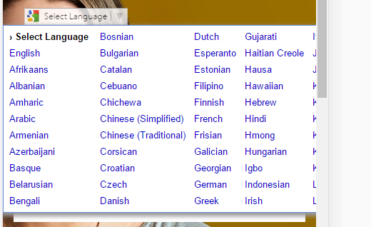
I'm having a bit of a problem with google's translate plugin on my site. It appears fine in desktop mode but as I move down to mobile the width of the dropdown exceeds the browser width.
Is there anyway to prevent this from happening?
best regards
I'm having a bit of a problem with google's translate plugin on my site. It appears fine in desktop mode but as I move down to mobile the width of the dropdown exceeds the browser width.
Is there anyway to prevent this from happening?
best regards
As you can't add css to elements that don't exist you have to add it after you click on the translate dropdown CTA. This jquery works for me.
$('body').click('#google_translate_element', function () {
    if (($goog = $('.goog-te-menu-frame').contents().find('body')).length) {
        var stylesHtml = '<link rel="stylesheet" href="/css/google-translate.css">';
        $goog.prepend(stylesHtml);
    }
});
With this css.
.goog-te-menu2 {
    width: 300px!important;
    height: 300px!important;
    overflow: auto!important;
}
.goog-te-menu2 table,
.goog-te-menu2 table tbody,
.goog-te-menu2 table tbody tr {
    width: 100%!important;
    height: 100%!important;
}
.goog-te-menu2 table tbody tr td {
    width: 100%!important;
    display: block!important;
}
.goog-te-menu2 table tbody tr td .goog-te-menu2-colpad {
    visibility: none!important;
}