When trying to determine what layout(s) you should use, you should start by trying to determine areas of responsibility...
For example...

Based on your needs, I might start with a GridBagLayout. This might seem complex, but if you break the UI down into seperate components, focusing on their individual needs, it should become simpler...
For the panel on the left...
I would be temptered to use a GridBagLayout, simply because it allows the components to use there preferred sizes, but still allows you to set up a grid like pattern...
For the arrow buttons...
This becomes a little more complicated, but I would use a GridLayout(2, 3) (2 rows, 3 columns). This will require to add a filler panel at the first and third position along the top row, but still maintain the buttons at a equal size...
For this panel...

I would be tempted to either use a GridBagLayout, because it will allow you to span the rows or even split it again into two separate panels, with the controls on the left in a GridLayout(2, 1) and the control on the right in something like a BorderLayout as required...
For "progress" panel...
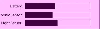
I would be tempted to use...GridBagLayout. Mostly because it would allow you to provide more weight to the progress bars then the labels.
For the main panel...
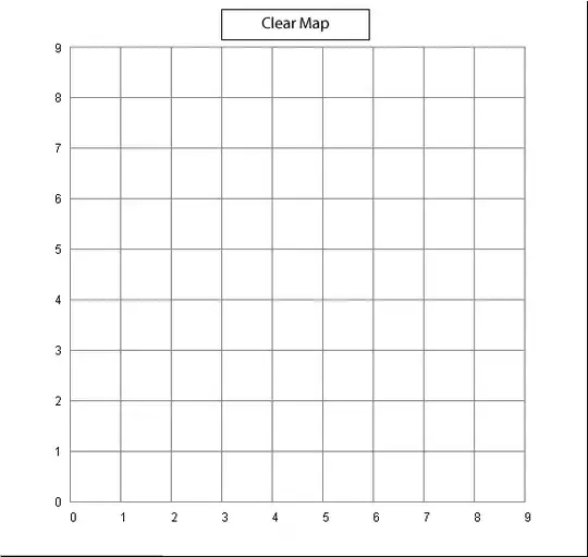
I would probably be tempted to either use a BorderLayout, with the Clear Map on another panel of it's own, allowing it maintain it's preferred size, in the NORTH position and the map panel in the CENTER or even a GridBagLayout depending on what the invidual components are...
